
Dr. Felipe Umeda
Branding
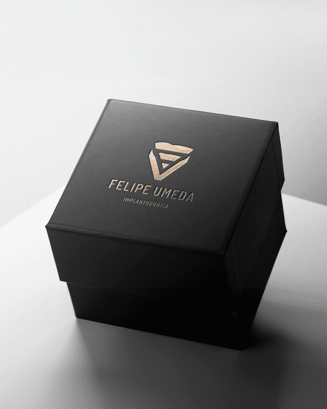
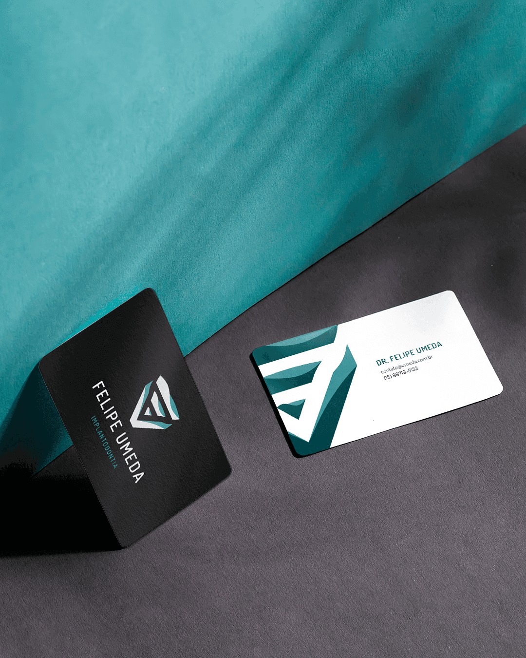
Dr. Felipe Umeda is a dental professional focused on providing modern, high-quality care. The goal was to build a distinct brand identity that establishes trust and reflects his clinical expertise. The project delivered a complete visual system, including logotype, brand guidelines, and print collateral, creating a cohesive and professional experience for his patients.
Date
Nov 2022
Role
Designer
Deliverables
Visual identity and print materials
🧠
Brand Discovery
Analyzed market trends to balance clinical authority with warmth. Identified that premium patients prioritize clear communication and modern aesthetics.
🎯
Strategic Positioning
Translated technical precision into a clean, minimal visual identity. Positioned the practice around reliability, modern care, and professional excellence.ㅤ
💡
Visual Concept
Integrated the initials F, V, and U to form the structure of a dental implant. The symbol visually translates the titanium screw and final tooth, avoiding traditional clinical clichés
Explanation concept

F (Felipe)
Process & Visual Explorations
Iterative analog and digital exploration to develop a clean, scalable symbol that works seamlessly across all brand touchpoints.


Logotype
The result is a minimal and refined logotype that beautifully reflects elegance and subtlety.


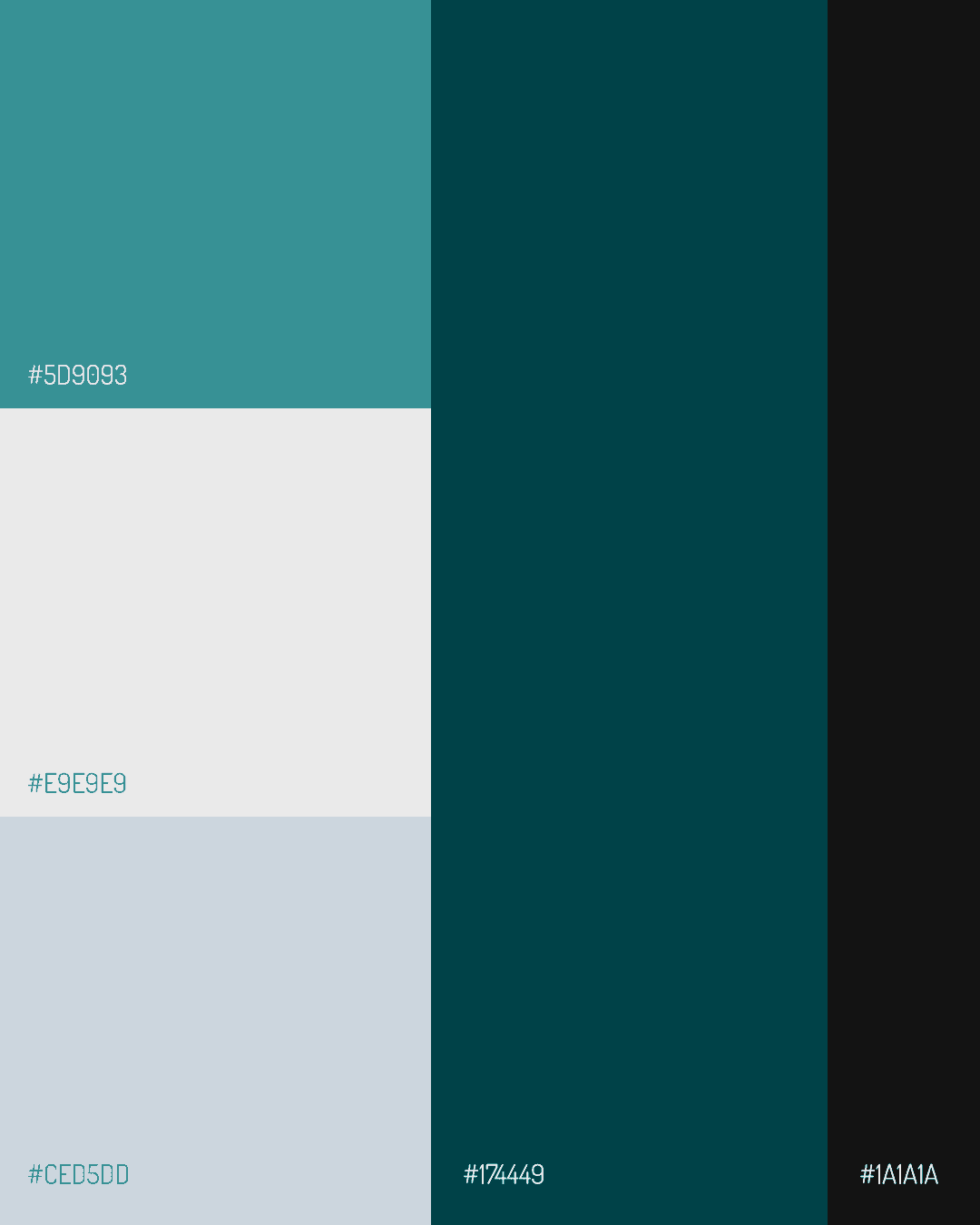
Social media visual strategy developed to reinforce clinical authority. The system ensures consistency, utilizing a clean color palette and structured typography to educate and engage patients.




Process by hand
Hand-drawn sketches were used to test geometric proportions, balance, and flow before moving to digital vectorization, ensuring the final symbol is structurally sound.

The visual identity captured exactly what I wanted for my practice: modern, clean, and highly professional. It elevated how patients perceive my work right from their first interaction with the brand, giving them confidence in the quality of care they will receive.
Dr. Felipe Umeda

Rafaela Alencar
Designer Visual | UI/UX
© 2025